What Is a Task Contribution Graph? (And Why You’ll Want One)
A task contribution graph is a visual map of your daily work – turning invisible effort into something you can actually see.
Most of us do more than we realize. The little things – the emails sent, the slides tweaked, the features shipped, the bugs logged, the posts written – tend to disappear into the void as soon as they’re done.
Which is fine, until it's not.
Because when you look back at your week or your month or your year and feel like you’ve done nothing, it’s rarely because you’ve been lazy. It’s because you’ve been unseen.
That’s where the task contribution graph comes in.
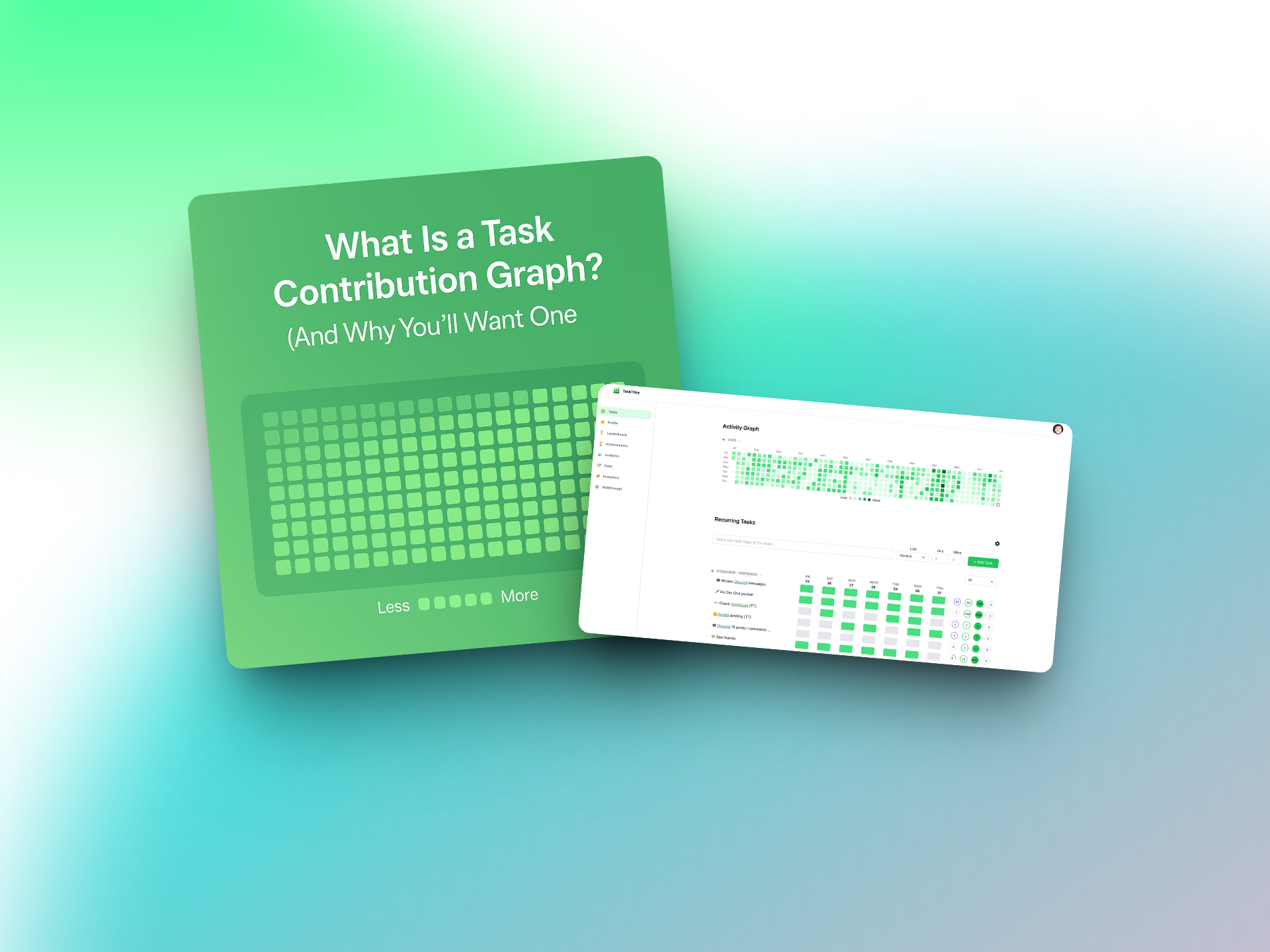
Wait, What’s a Task Contribution Graph?
Think of GitHub’s contribution graph – the one with the little green squares that developers obsess over. Every time you push code, a square gets filled in. Over time, you build a streak. You get a visual history of your work. It’s addictive, motivating, and, honestly, kind of beautiful.
A task contribution graph works the same way, but for all kinds of work.
Design. Marketing. Ops. Writing. Recruiting. Personal projects.
Every time you complete a task – whether it’s recurring or a one-off – it shows up as a colored tile on a calendar grid. One tile per day. Over time, the grid fills in. Your work becomes visible.
Why It Matters
We live in an age where productivity is often measured by outputs but felt in inputs. A task contribution graph flips that. It’s not about how loud your work is – it’s about whether it exists at all.
Here’s what a task contribution graph gives you:
✅ Momentum
When you see a streak forming – five days in a row, then ten – you’re more likely to keep going. It taps into that “don’t break the chain” feeling that powers habit formation.
✅ Clarity
You stop wondering where your time went. You can look back and literally see what you worked on each day.
✅ Motivation
Empty days? They’re not guilt trips. They’re signals. They say: hey, maybe today’s a good day to show up.
✅ Reflection
At the end of the month or year, you have something to reflect on. Not a vague memory of being busy – but a real map of your effort.
Who Is This For?
The short answer? Anyone who works.
The long answer:
Freelancers who want a portfolio of consistent output, not just polished final products
Startup founders trying to keep themselves and their teams accountable
Designers who rarely ship “code,” but still show up every day
Writers, marketers, researchers, operators, recruiters – the people whose work moves things forward even if it doesn’t “launch”
Basically: If your contributions don’t fit neatly into GitHub, Jira, or a spreadsheet – need your own graph.
Why You’ll Want One
Because seeing your work is the first step toward owning it.
Because progress shouldn’t be invisible.
Because little wins, over time, are what build careers – and confidence.
How TaskTiley Makes It Happen
TaskTiley was built for exactly this: to help people across disciplines track their daily work with a visual contribution graph.
It supports:
✅ Recurring tasks like “write for 30 min” or “check campaign metrics”
✅ One-off tasks like “submit project proposal” or “publish blog post”
✅ A beautiful 365-day view of your activity
✅ A leaderboard (if you want to see how others are showing up too)
✅ Tool integrations, so your effort doesn’t get lost in platform silos
You don’t have to “be productive.” You just have to show up. TaskTiley takes care of the rest.
The Takeaway
Your work deserves to be seen – not just when it’s finished, but while it’s happening.
A task contribution graph doesn’t just track your effort.
It reflects it.
And once you start seeing that, it’s hard to go back.